Here’s 10 awesome billboard advertisement ideas for real estate agents (and a few to avoid). This article will walk you through the do’s and don’ts for effective billboard advertising to build your brand and generate inquiries.
 When they say you only have 10 seconds to make a good impression, they really mean it, especially with billboard advertising.
That’s because while billboards are seen by thousands of people, drivers are busy. Most billboards miss making an impact.
This is why it’s so essential to get the design of a billboard right.
You want to maximize your investment by having your billboard seen by every driver. But you also want to make it clear how they can contact you.
Think of how hard it is to read a billboard while driving. Yet designers often make words small or use skinny fonts. How many drivers wearing prescription glasses miss these ads? Furthermore, drivers only have 1-3 seconds to take in all the information on a billboard. Anything more than a simple sentence will be missed.
So here’s a list of Billboard designs that have done a great job and few that have done a terrible job (so you can learn from their mistakes).
1. Keep the contact information readable
There is nothing worse than seeing a billboard that has something you want, but you can’t read the contact information because it’s too small. Or worse, there is more than one phone number so you don’t know which one to call.
Also, unless your website URL is really short and easy to remember, leave it out. No one has time to enter an URL while driving.
The key to getting inquiries from a billboard is keeping the contact information concise and BIG.
While it’s tempting to include all your contact details and add extra logos and tag lines into your billboard, don’t. It will only serve to clutter the billboard and the information you want people to find can get lost.
Here’s an example of what a billboard looks like when the contact information is obvious.

This next billboard would benefit from a phone number. But other than that, it’s a perfect example of what a readable billboard looks like. They’ve left out all the things that clutter billboards, like extra logos and titles.
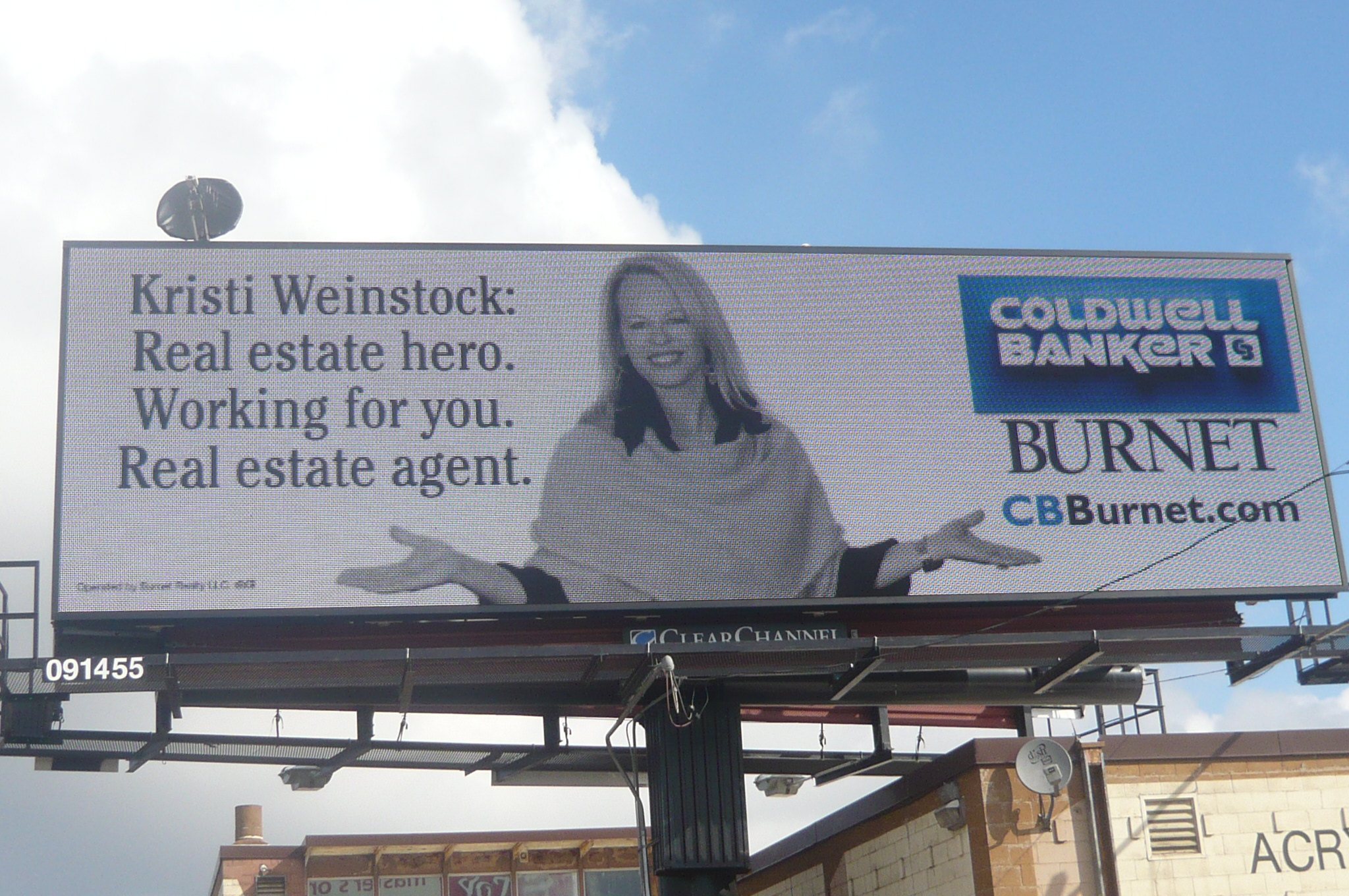
Here’s a few examples of what not to do as they are not easily readable and contact information is lost.
In this first example the phone number is much too small and there is too much text. As a result it’s hard to read.
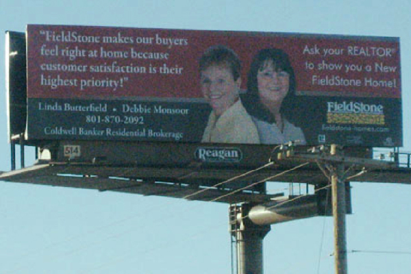
In this next example it’s too cluttered which makes it hard to scan for the contact information.
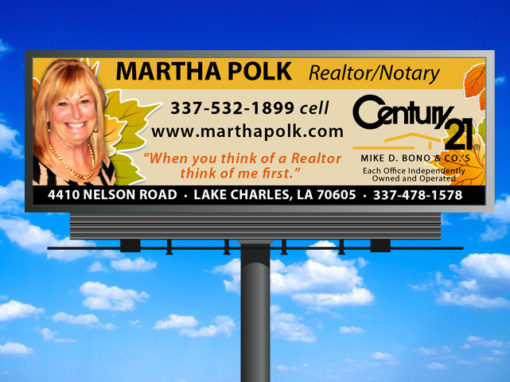
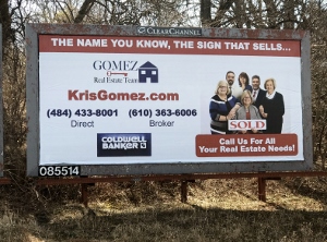
Finally, in this last example of what not to do, there is too much going on in this billboard. If someone were driving past, they wouldn’t know which number to write down. And they have 2 logos, cluttering the sign, and their tagline at the top gets lost.
2. Match the message to who you are targeting
Do you want more home sellers and listings? Or do you want to work with more property buyers?
Great messaging connects with your target customer. People thinking of selling their home may be concerned about how long it will take to sell or even if their home will sell. Using a message that creates confidence in this area will resonate with these home sellers.
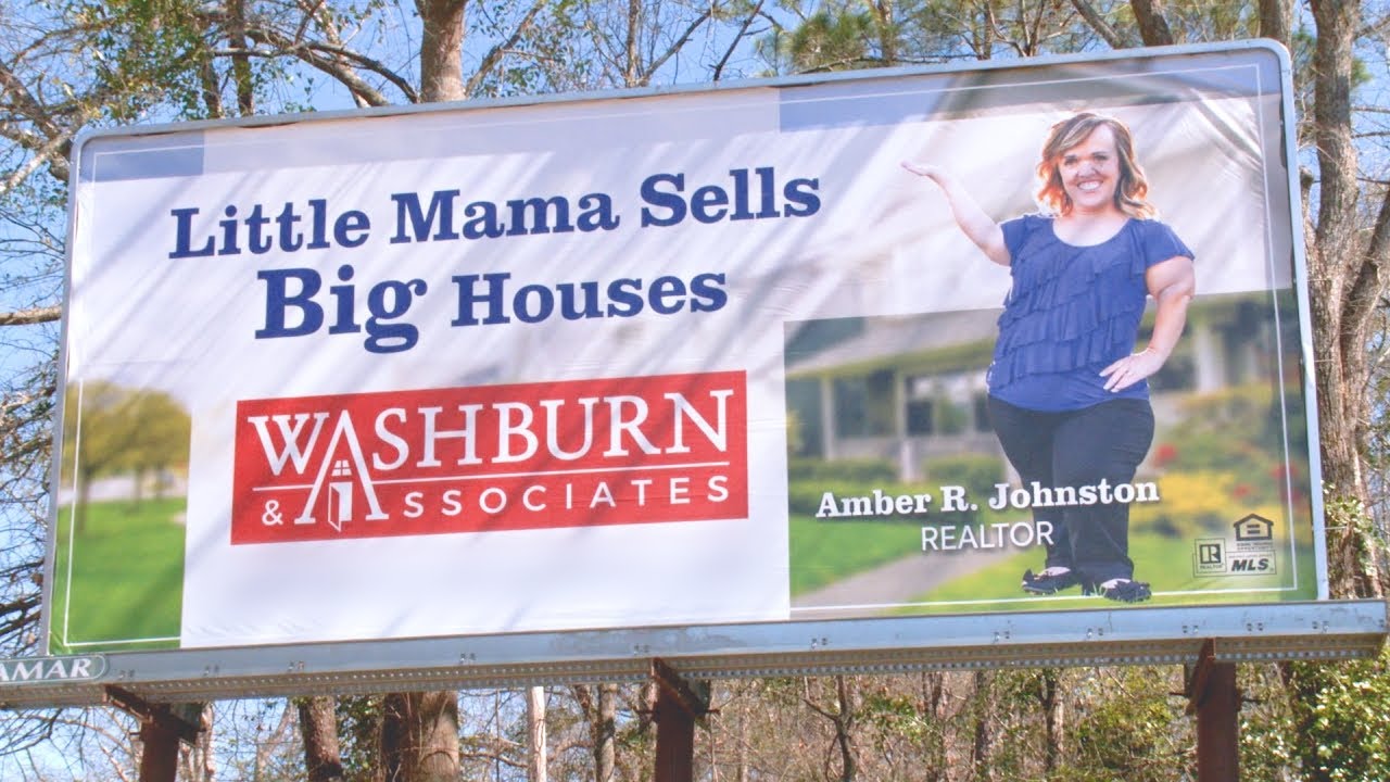
Home buyers meanwhile have different needs. They may be thinking of relocating, down sizing or finding the right home to match their families needs. Using a message like “Love where you live” or “Your dream home is closer than you think” will ensure you attract more of these types of people.
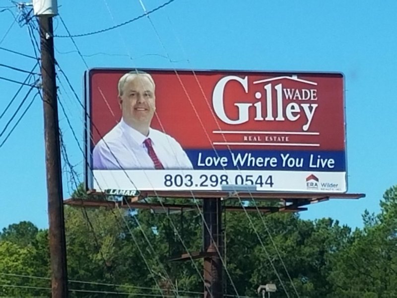
3. Keep your billboard’s message about your customer
It can be tempting to tell the world how great you are in an attempt to attract more clients. Great marketing understands that the most compelling messaging is one which is empathetic to your customer’s needs.
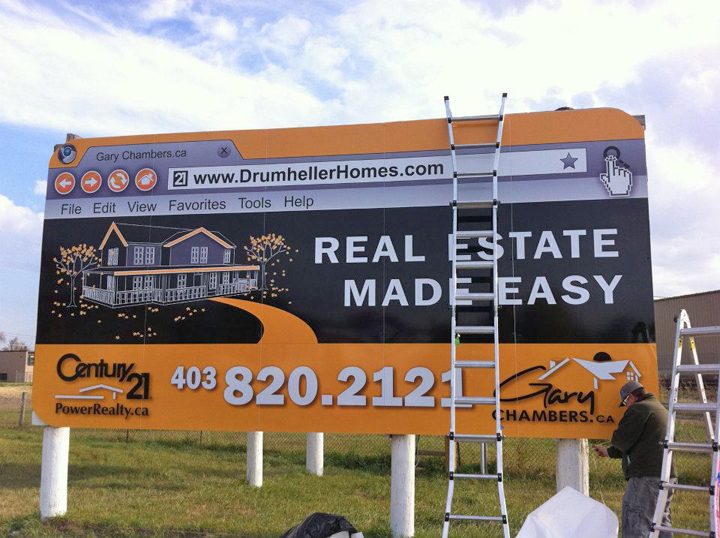
This next picture is an example of what not to do. While it stands out and is an attractive design, “Leader of the pack” isn’t communicating the value this company likely provides to their home sellers and buyers. This message would make more sense if they were a company that helped people pack when moving.
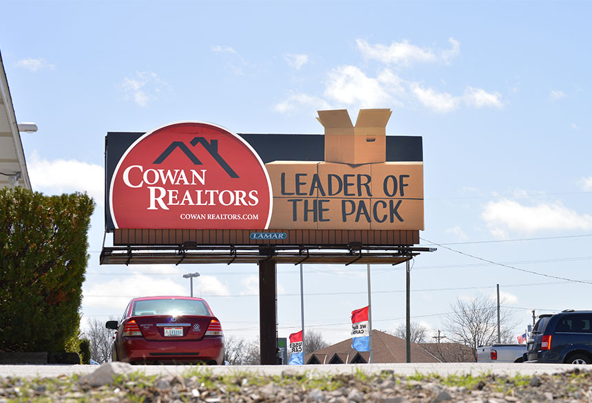
4. Match your billboard branding to your print marketing
Billboards are powerful brand builders. They may not make the phone ring every day, but they will get seen every day. You will want to make the most of this opportunity.
Building a brand is all about being consistent. When people see the same brand multiple times they become familiar with it. Soon they will recognize your brand and will immediately know who you are with future marketing.
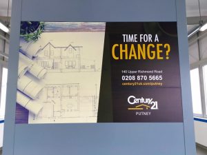
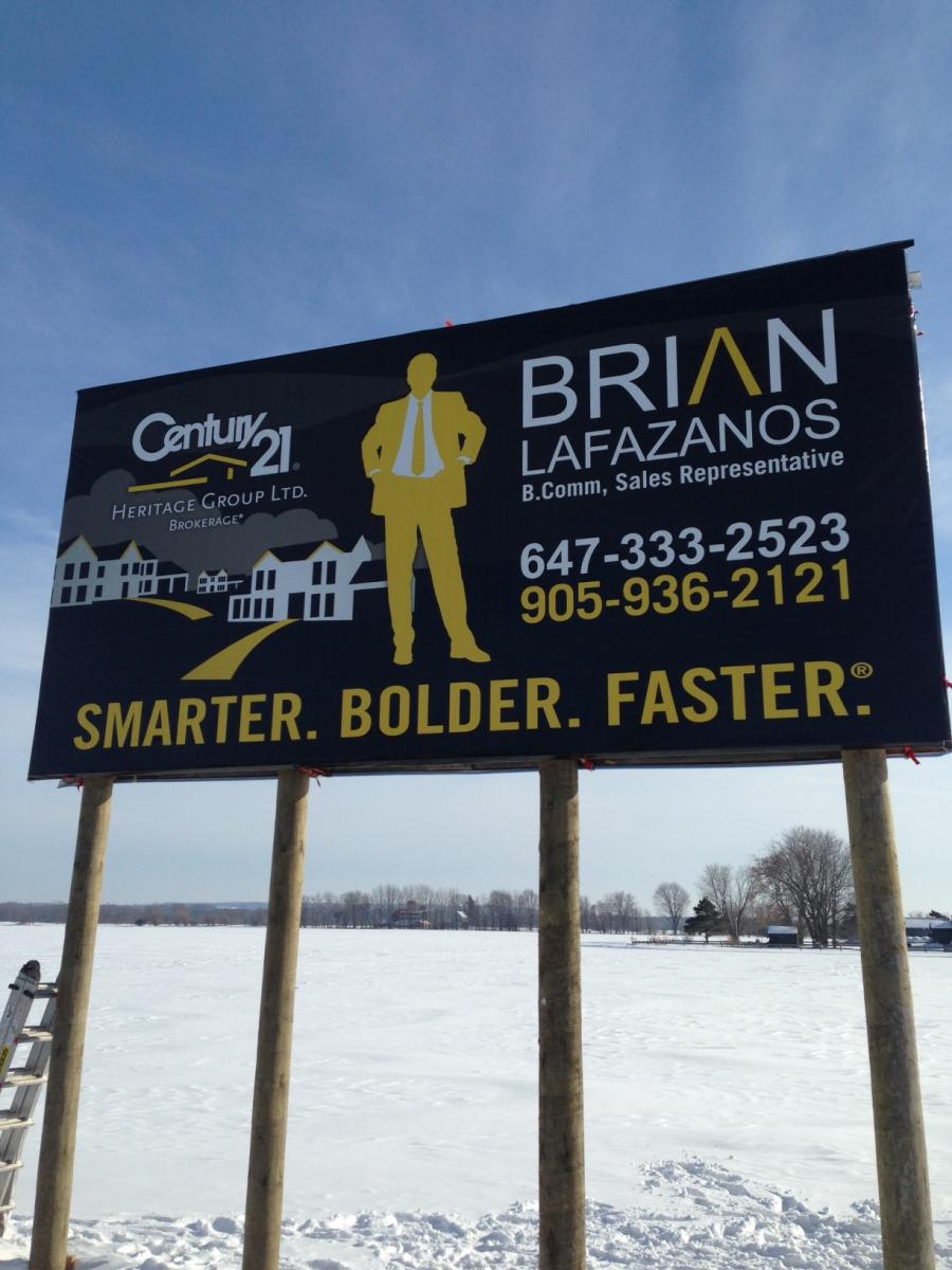
Below are two marketing pieces that match.
5. Together, We can turn hope into home
Use positive emotions to create a connection between your brand and the customer.
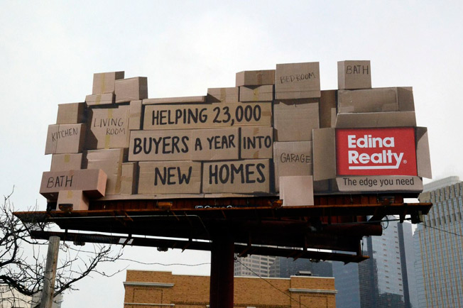
The combination of imagery and copy can be a powerful way to tell a positive story. When you do this you well you will set your business apart. This advertisement does a great job with their copy, “The best seat in the house belongs in your dream home. Let us help you find it.”

Edina Realty doesn’t mind taking a few risks with their marketing. By using a positive message, they are turning what could be a terrible billboard mistake into a positive feeling that they really care about home buyers.
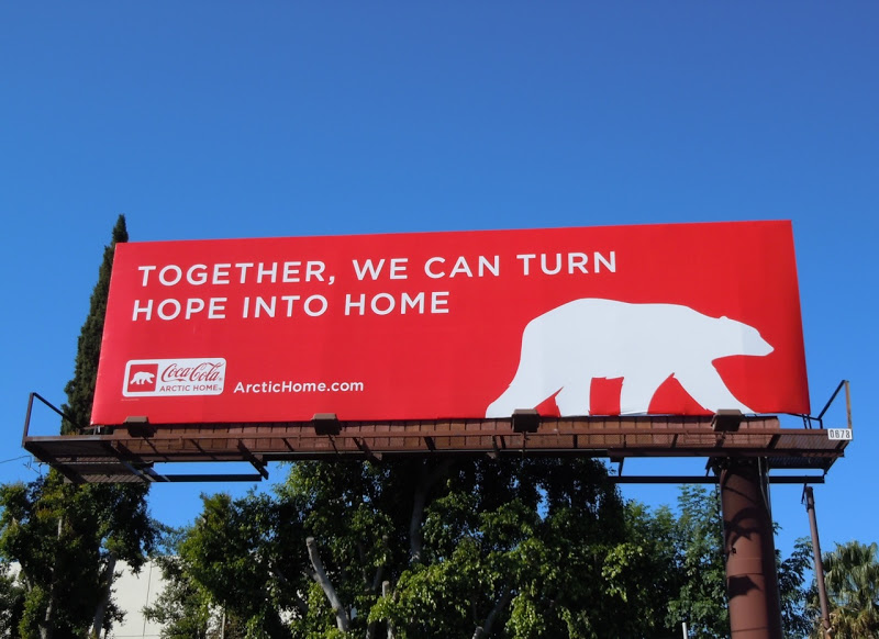
CocaCola does amazing marketing. There is a reason it remains the world’s largest brand soft drink.
6. Have fun and stand out
A creative design can catch people’s attention. It’s okay to do something outside of the norm when the previous points we went over are taken into consideration.
Here’s a great example of a billboard that is clearly real estate related, but is fun.
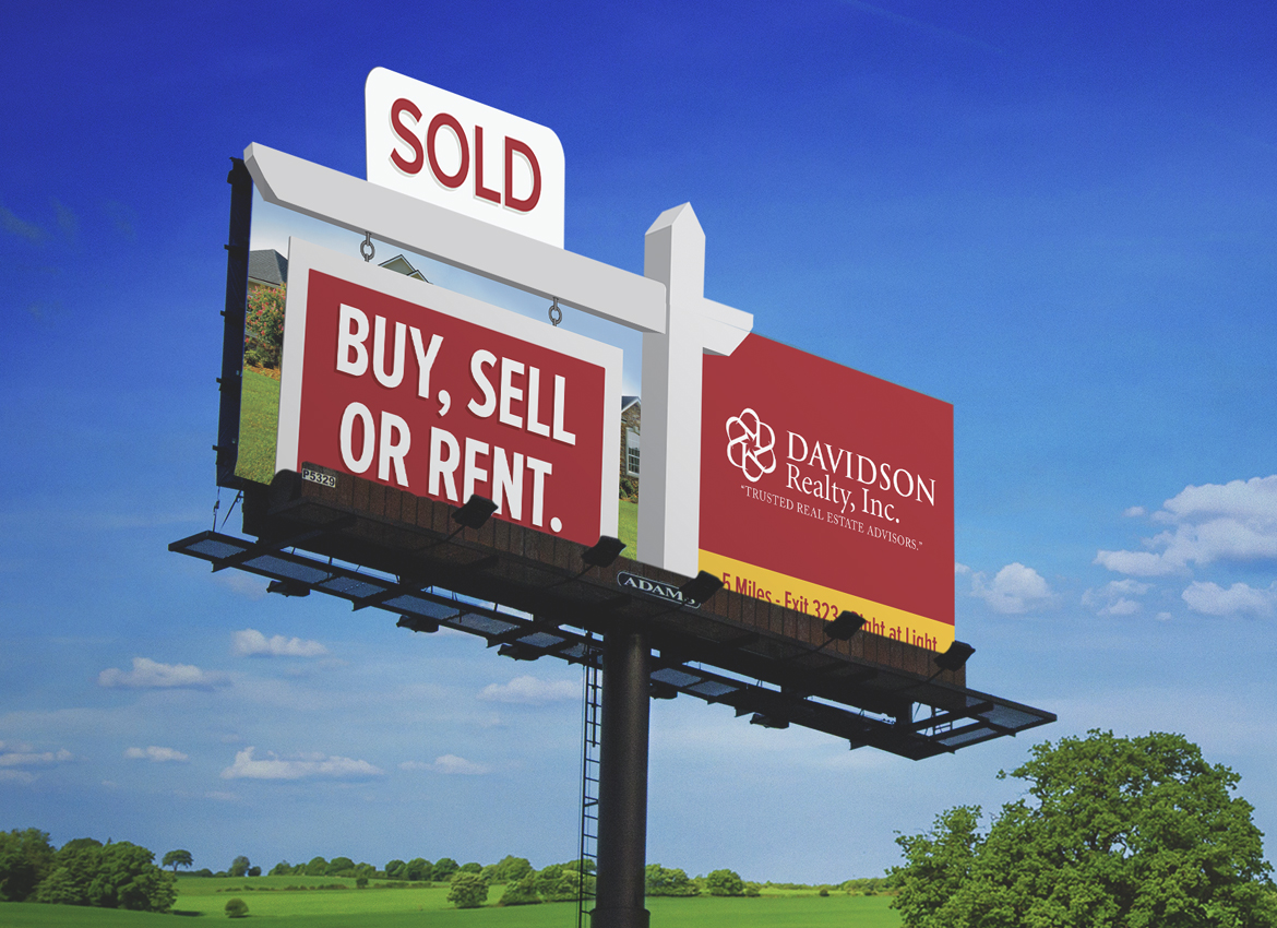
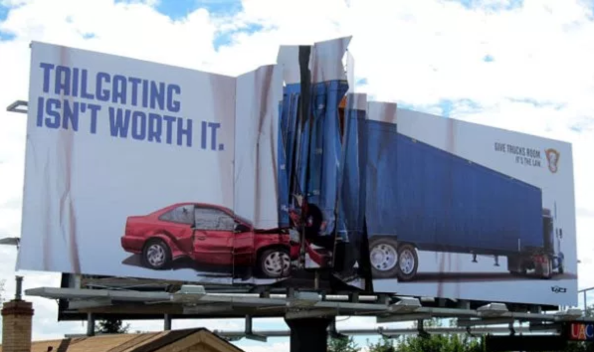
7. Tailgating Isn’t Worth It
Even though this billboard isn’t for Real Estate it does a great job of demonstrating what a good billboard design can do to emphasize the message. Keep your message simple and clear. This is a great example of a billboard that gets the intended point across quickly.
Conclusion:
Keep your message simple to clearly communicate how it will help your target customer. Less is more. So show only 1 phone number. And use positive emotions to draw customers to your brand. A lot of people think that shock gets people’s attention. But what they don’t realize is that if it is perceived as negative, people will do what they can to avoid it.
So to recap:
- Keep the contact info readable
- Match the message to who you are targetting
- Keep the message relevant to your customer
- Match your billboard branding to your print marketing
- Use positive emotions to create a connection with your reader
- Have fun with the design
- Use the design to emphasize the point you want to get across
Billboards can be a very powerful way to build and establish your brand name in your target market. By aligning it to your brand’s visual identity you will reinforce your name in the community and make it easy for people to recognize you when deciding who to do business with.

Other Interesting Blog Posts:
Real Estate Facebook
Real Estate Leads
How to capture real estate leads online today.
Facebook Real Estate Leads
How to generate inquiries with Facebook farming
Facebook Real Estate Ads
Generate Ongoing Facebook Leads
Introducing you to the proven strategy that will grow your business






8 Responses
I love the examples of billboards you have here. A lot of your points work for everything, not just real estate. I like what you said about keeping it simple and clean, and avoiding have too much going on. That’s a basic art concept, but it’s crazy how many companies don’t follow it on billboards.
Hi Ridley,
Thanks so much! And yea, the basic art concept isn’t often followed when it comes to creating billboards. So interesting!
Jonathan, I enjoyed reading your article.
Your right on about keeping signage simple and readable.
What you have left out in making it memorable is the use of vanity numbers and specifically toll free 800 numbers.
Signage with toll free 800 vanity numbers like 1-800-R.E.AGENT for real estate is nine times more memorable than it’s numeric equivalent. If a real estate agent or company is going to spend thousands of dollars advertising they should maximize their return on investment by using a well chosen vanity number.
That’s a good point Doug, thanks
That’s an awesome compilation, Ridley! So many creative ideas.
Just another example of how to keep your message simple, yet creative.
Sorry, Jonathan. My comment was addressed to you, not to Ridley )
Thanks for sharing those examples, Jonathan. I like those “out of the box” ideas
Hope it was inspiring Tanya