Creating a successful Facebook campaign starts with the ad. If it looks and feels like it belongs on the newsfeed then people will engage with it. Today I’m going to walk you through the 4 Tips for making Facebook ads look native 🔰
The goal of any Facebook campaign is to stop the user from scrolling and spend a few seconds looking at the ad.
People come to Facebook to connect with friends, to see something familiar, and to see what’s happening locally. So creating ads on FB is all about making it look as native as possible. It needs to feel like an organic post.
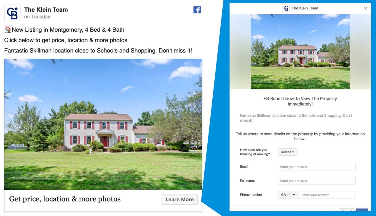
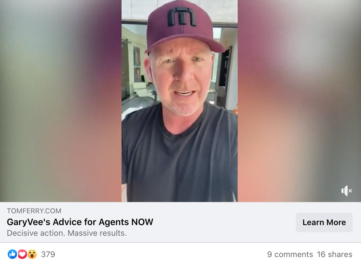
1️⃣ Use an image (or video) people will identify with
- Show something that the user can feel related to
- Try to avoid very generic stock images
- Give context to your readers.
(Harder than I would have thought to find an ad that does this well, but Tom Ferry pulls it off)
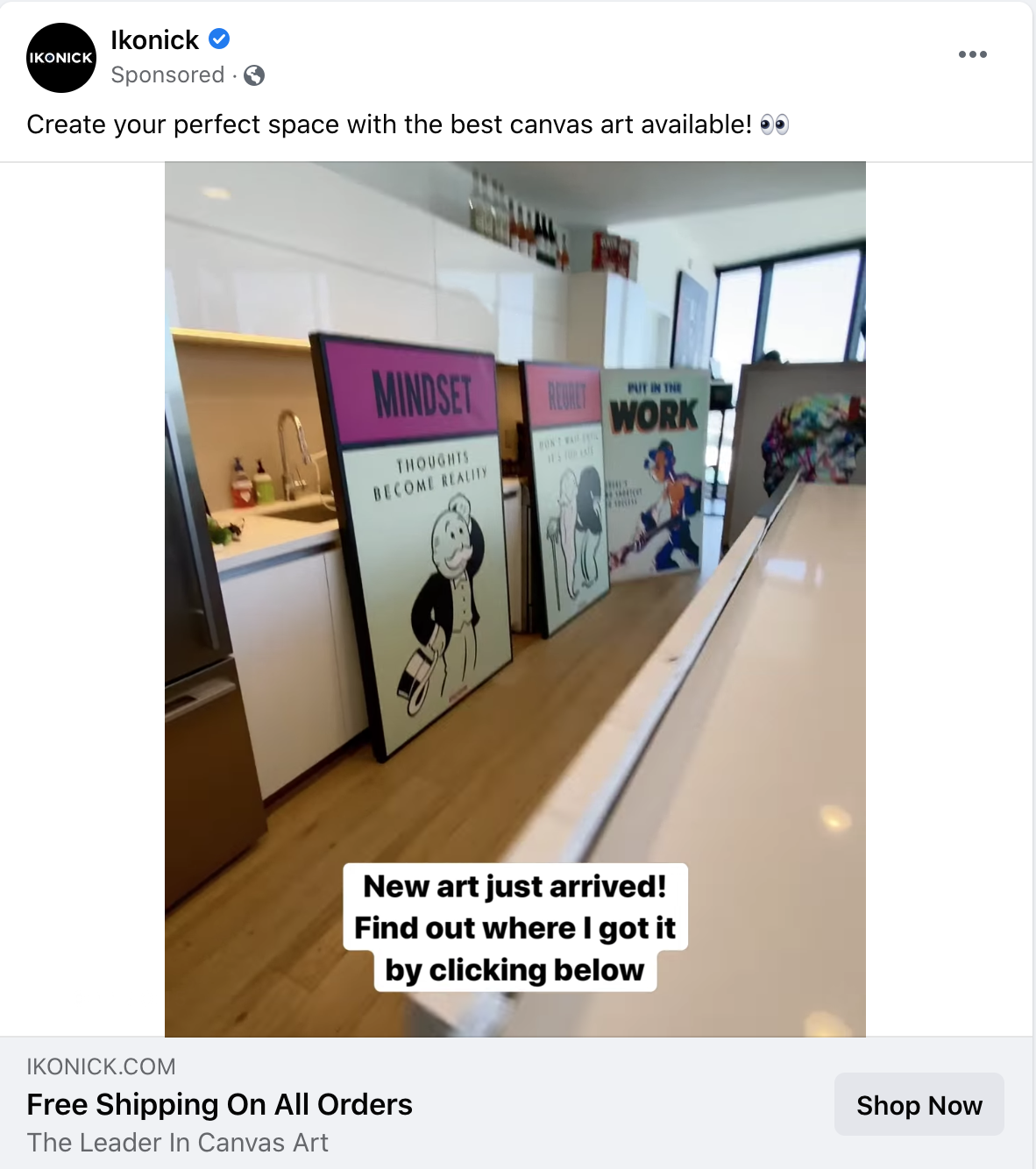
2️⃣ Use legible text that is less than 20% of the ad
- Use fewer words, shrinking the font size to keep that ratio will make the text invisible.
- Contrast the font color with the background.
- Increase readability with two different font weights.
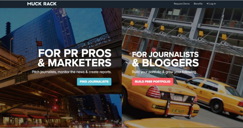
3️⃣ Match the background to the landing page.
- This tactic drives follow through.
- The continuity lets the reader know they landed on the right place
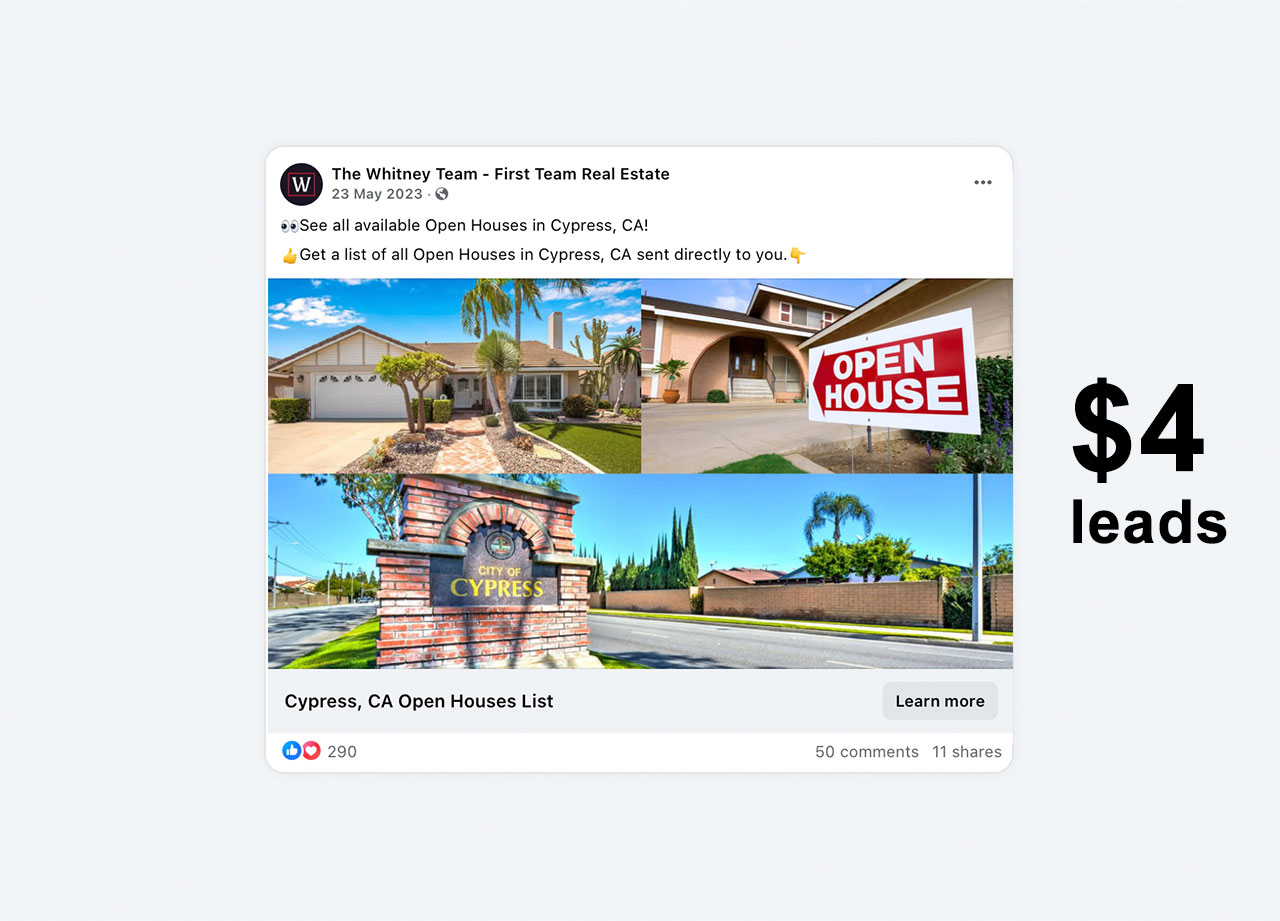
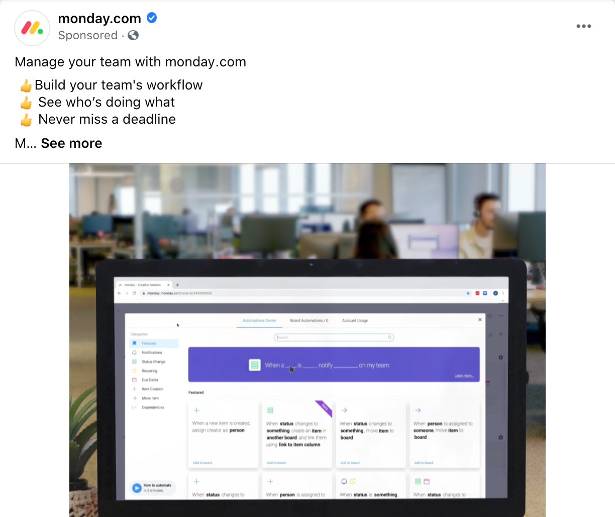
4️⃣ Icons and graphics are your friends 🌈
- Use emojis in the text and headline.
- They catch the eye of the reader or direct it towards a call to action.
There you have it, you’re off to the races. Let me know how it goes!

