1.93 billion people visit their Facebook feed every day. This gives you an amazing opportunity to grab their attention and get them to take action.
Facebook analyzed their ads and found that the creative accounts for 70% of the conversion. So the image matters… a lot.
More than 139,148 ads have launched from StreetText. So we get to see exactly what images are working best for ads everywhere.
Let’s dive in.
🔥 Goal: an image that slows the scroll of the person.
It’s about slowing the scroll long enough for them to read the copy and the offer and decide if it’s something they want, or not.
💡 Tip: Facebook did a study and found that photos that included furniture or scenes from a home increased people’s conversion rate. That makes sense as it’s about relatability. If it’s a scene that people are familiar with then people could “see themselves” with the product.
1. 🔥 Use images that look native to Facebook.
A mistake people often make is they use stock photos. Any image that screams of an ad cause people to scroll on past without thinking.
Instead instead use a photo that looks like your friend took it.
*If you’re wondering what a native post looks like, visit your Facebook feed and look at the images there. Here’s 2 posts that came up on my feed. You can see the difference between an ad and a native post.
The secret is to make your ad look like the native post.
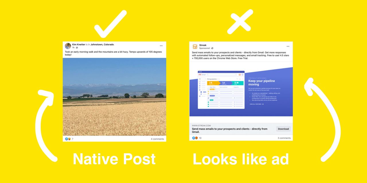
An image doesn’t necessarily need to be be high resolution to work well on Facebook. It needs to look like it was posted organically. The more organic the image, the more it will help stop the scroll.
When it’s a stock photo, people subconsciously scroll on past.
2. 🔥 For offers: Use a highly local or relevant image.
When you break the rules of “good photography” you tend to do better on Facebook.
The key is that it’s about the subject of the photo, not the quality of the photo. Is it intriguing enough that it’s worthy of my attention to read the copy.
💡 Tip: Use Canva or Photoshop to increase the saturation to make the image pop.

When you use an image that is familiar, nostalgic or local then it’s relevant to the people in your community. As it’s more about them and their community than it is about the ad and the offer.
3. 🔥 For listings: Sexy sells.
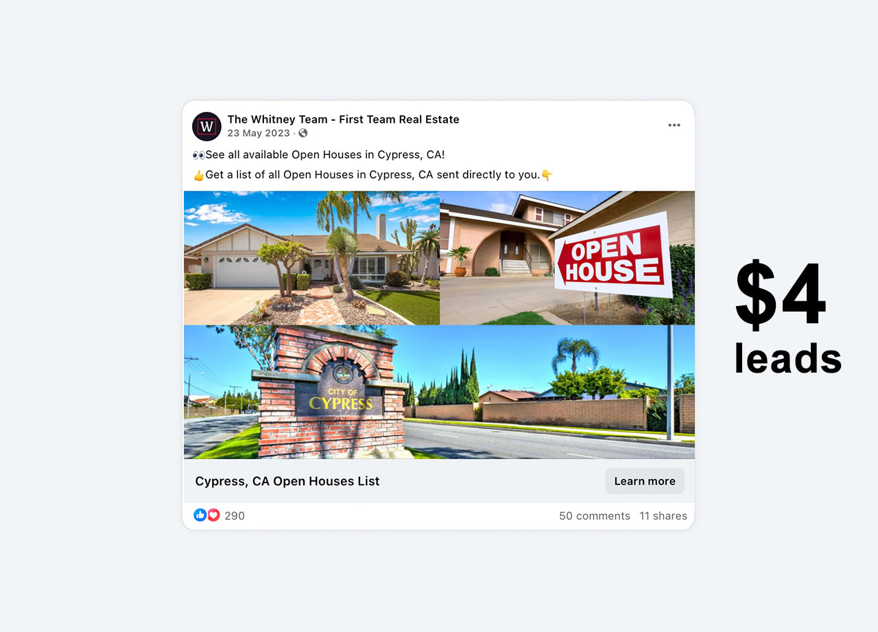
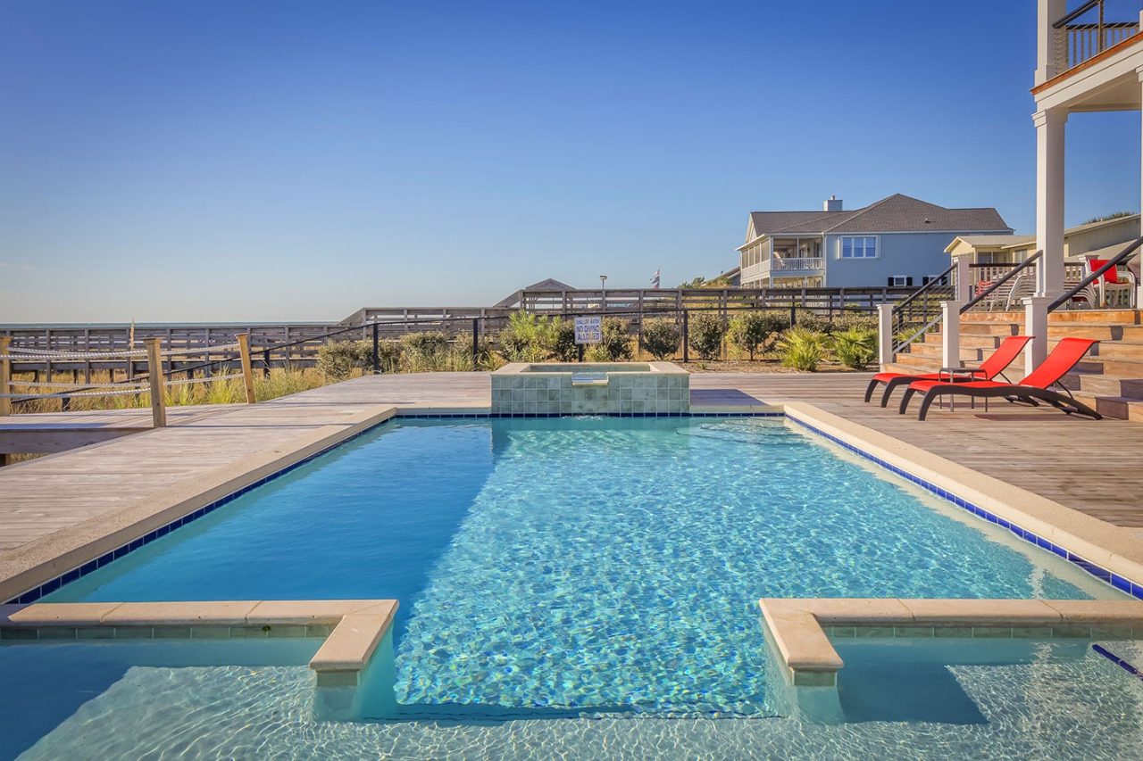
You want to use an image that is attractive for the price point. Something that the majority of buyers are looking for. For example, homes with pools. Use a home in that price point with a beautiful pool.
High quality photos work well for this type of ad.
Again, use real photos of real listings. And it must not look like a stock image. As people will scroll on by.
This is for listings and for property lists.
Tip: Share just 1 to 3 shots of the property. Create curiosity so people will want to click the image to see more.
4. 🔥 Image size is important.
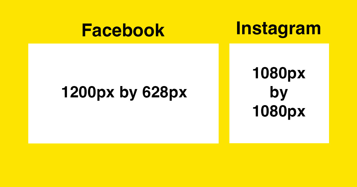
Facebook recommends an image with dimensions of at least 1080px by 1080px and a maximum file size of 30mbs.
The landscape format looks best on the Facebook feed. Whereas square photos look best on Instagram.
💡Tip: go to Canva and use their Facebook post template. Or their Facebook ad template. Both work for the dimensions.
🔥 Text on photos?
The 20% text limit is gone. BUT, and it’s a big BUT, Facebook recommends leaving 14% (or about 250 pixels) space above and below the text.
We recommend keeping text to a minimum. The more it looks like an ad the more people scroll on past.
With that, I wish you all the best as you crush your Facebook ads :)
Ready to give StreetText a shot? And save the hassle of figuring out the creative? Try StreetText for 7 days here.


